
Every Picture Tells A Story
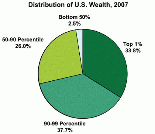
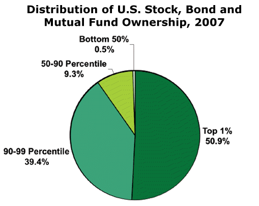
Pie charts from Inequality.org
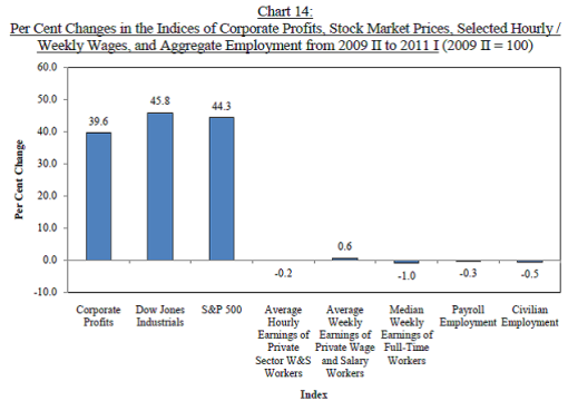
The Magnitude and Sources of Economic Growth Through 2011 [PDF] by Andrew Sum, Ishwar Khatiwada, Joseph McLaughlin, and Sheila Palma at the Center for Labor Market Studies, Northeastern University, Boston, Massachusetts.


2 comments
I was browsing your latest posts and noticed no one commented on this one yet. I think these graphs are just stunning. Right before the Great Depression we saw this type of disparity between “just folks” and the upper crust. We keep hearing how things are improving, but it makes you wonder if this is just the lull before storm. Perhaps the 2008 crash wasn’t THE crash.
Juanita, if they don’t stop messing around and raise the debt limit, you will see another crash that will affect the entire planet. Congress and the President don’t seem to understand how important the “full faith and credit” of the United States is to transaction around the world. They don’t understand how much it will cost everyone to recover from the loss of the US Treasury bond being the most secure investment on the planet.
We have elected a bunch of fools to govern us.