
Mapping the Problem
Sue Sturgis at Facing South writes about Project Vulcan, a Federal program to map CO2 emissions in the US.
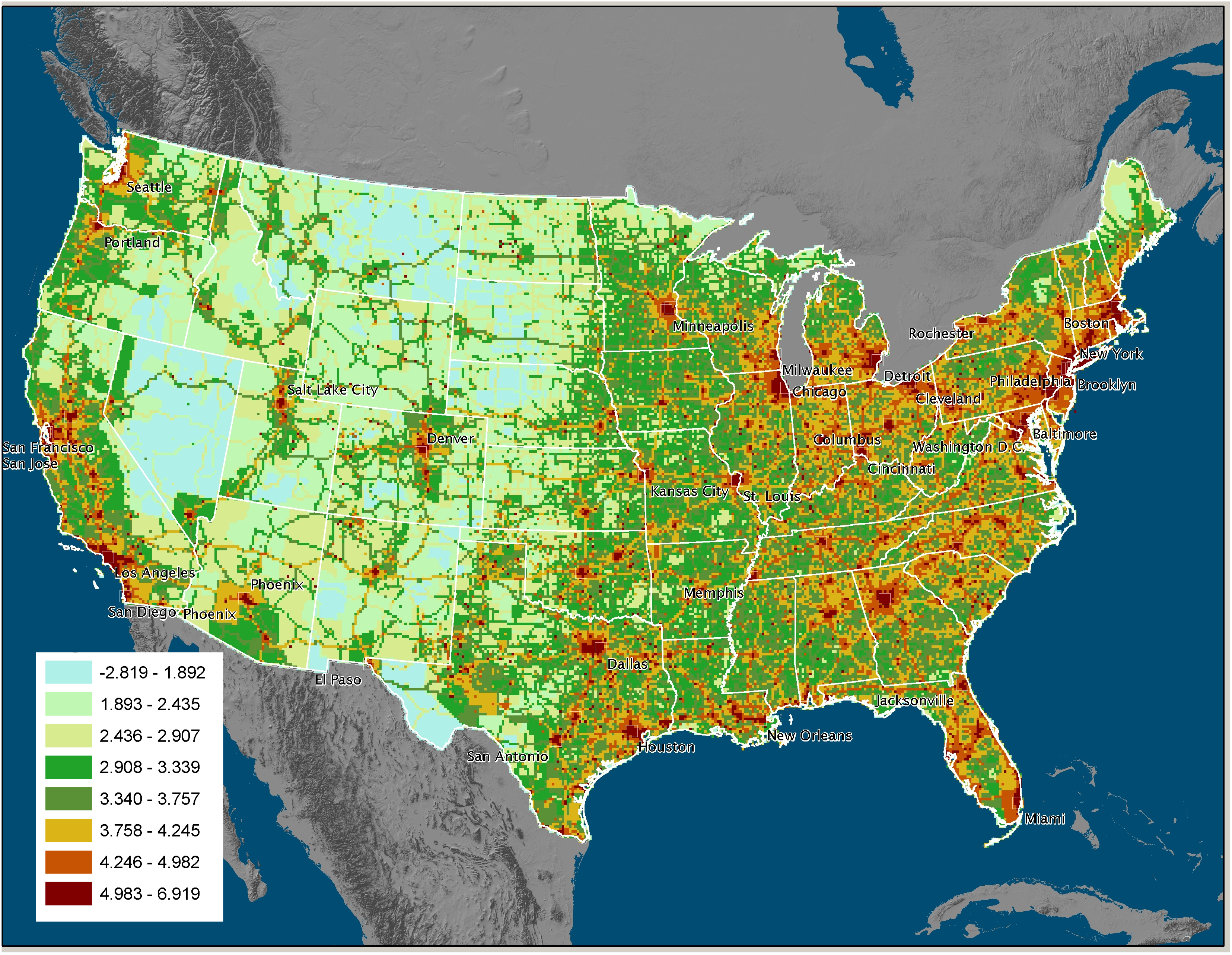
If you click on the map you will get a larger version from Purdue University, home of the project, so you can see how your area is doing. While I expected that the cities would stand out, one of the things that struck me is that the Interstates also stand out from the surrounding landscape. This is a powerful argument for decreasing automobile emissions, as the map clearly shows their effect.


2 comments
I knew NJ had crappy air. I’ll never forget flying into McGuire AFB and descending into yellow haze.
Driving into LA has that same layer of yellow crap.
LA is worst because it sits in a natural bowl – the winds can’t dissipate it and there isn’t much rain to scrub it.
Atlanta looks as bad as LA.